Borsbeek - branding (concept phase)
In 2025, Borsbeek will become the 10th district of the city of Antwerp. From that moment on, Borsbeek will be part of the Antwerp city group and will receive its own branding, following the guidelines of the city of Antwerp.
The goal was to give Borsbeek its own color palette (chosen within the existing colour palette of the City of Antwerp), a logo color, and visual style.
Borsbeek aims to create an inclusive, safe, warm, and vibrant community by focusing on quality services, sustainability, and citizen involvement. The objective is to improve the quality of life and be a pleasant place to live, work, and visit.
I was responsible for the new color palette of Borsbeek, the selection of the logo color and the creation of several brand guidelines to be applied across various communication materials.
Client: City of Antwerp
Tools: Adobe Illustrator - Figma - Adobe InDesign
Agency & credits: Shtick
Even though there was no strategic process planned beforehand, I wanted to visit Borsbeek myself to better understand and embody the values I was given by the municipality of Borsbeek. While walking through the village, I talked with the locals, experienced the green surroundings, discovered many sports facilities, and explored the local hospitality.
From the municipality of Borsbeek, I received a set of predetermined values to take into account.
Principle 1: Warm/Involved & Breathing Space and Green Environment
Principle 2: Inclusive & Dynamic, Lively and Vibrant
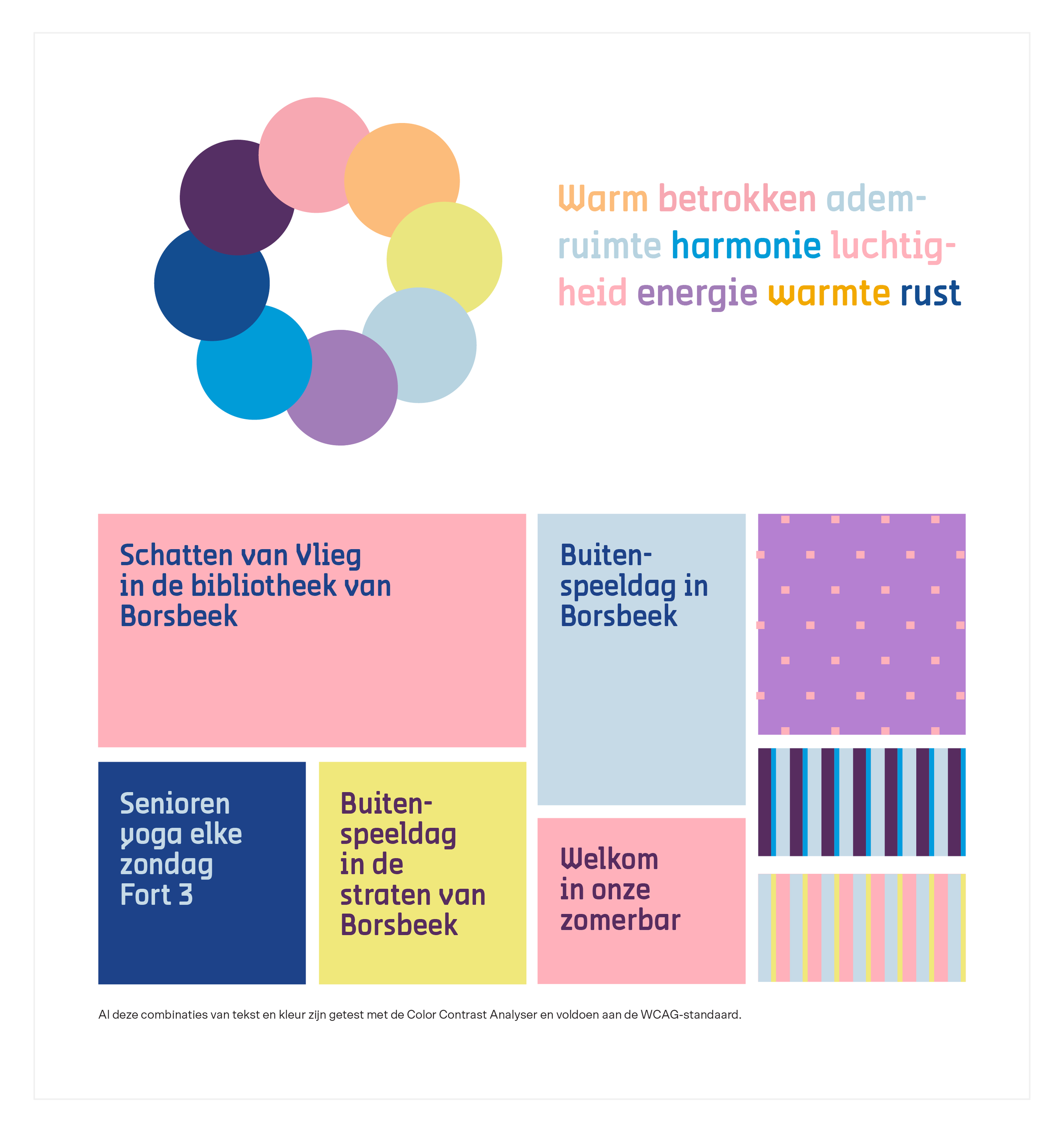
Concept for the colour palette of Borsbeek.
For each principle, I proposed two different colour palettes. Borsbeek needed to be recognised as the 10th district of Antwerp while still being distinct from the other districts. Communication needs to be clear and accessible, and the visual identity should be modern and remain relevant for years to come.
Principle 1: Calm Green
“Borsbeek is a green municipality with several parks that provide plenty of breathing space for the residents.”
Given the importance of warmth and community involvement for this principle, I aimed to highlight warm, energetic tones paired with cooler green shades. This approach fosters a harmonious balance between energy and tranquillity.
Mood board for Principle 1: Calm Green
Principle 1: Calm Blue
“Breathing space in our municipality means enjoying peace and open spaces.”
Pastel colours are ideal for conveying lightness and breathing room. Soft blue pastels exude clarity, freshness, and calmness. In contrast with warm tones like orange, you get a sense of both liveliness and tranquillity.
Pastel colours are perfect for expressing a sense of lightness and spaciousness. Soft blue pastels evoke feelings of freshness, and serenity. When paired with warm tones like orange, this combination offers a delightful contrast of liveliness and tranquillity.
Principle 2: Inclusive Purple
“There is great diversity in the community, both in terms of background and between newcomers and long-time residents.”
For this principle, I worked with a mix of purple shades. Purple, a colour that emerges from the blending of red and blue, is often seen as a symbol of cultural diversity. Since red represents passion and energy, blue signifies calm and stability. Together, they create a colour that resonates with the complexity and vibrancy of diverse communities.
Various shades of purple highlight the unique contributions of each individual and a sense of belonging and inclusivity.
Principle 2: Dynamic Red
To enhance the dynamic look of Borsbeek, I chose a bold yet limited colour palette. This approach is used by other strong brands, like Coca-Cola en Starbucks, to create a powerful visual identity. By combining one strong colour with white, a striking contrast is achieved, which supports the clear and straightforward communication Borsbeek needs. The branding for Borsbeek will be highly recognisable and consistent. For the dynamic colour, I chose red—both energetic and warm, just like the community of Borsbeek.
Colour of the logo
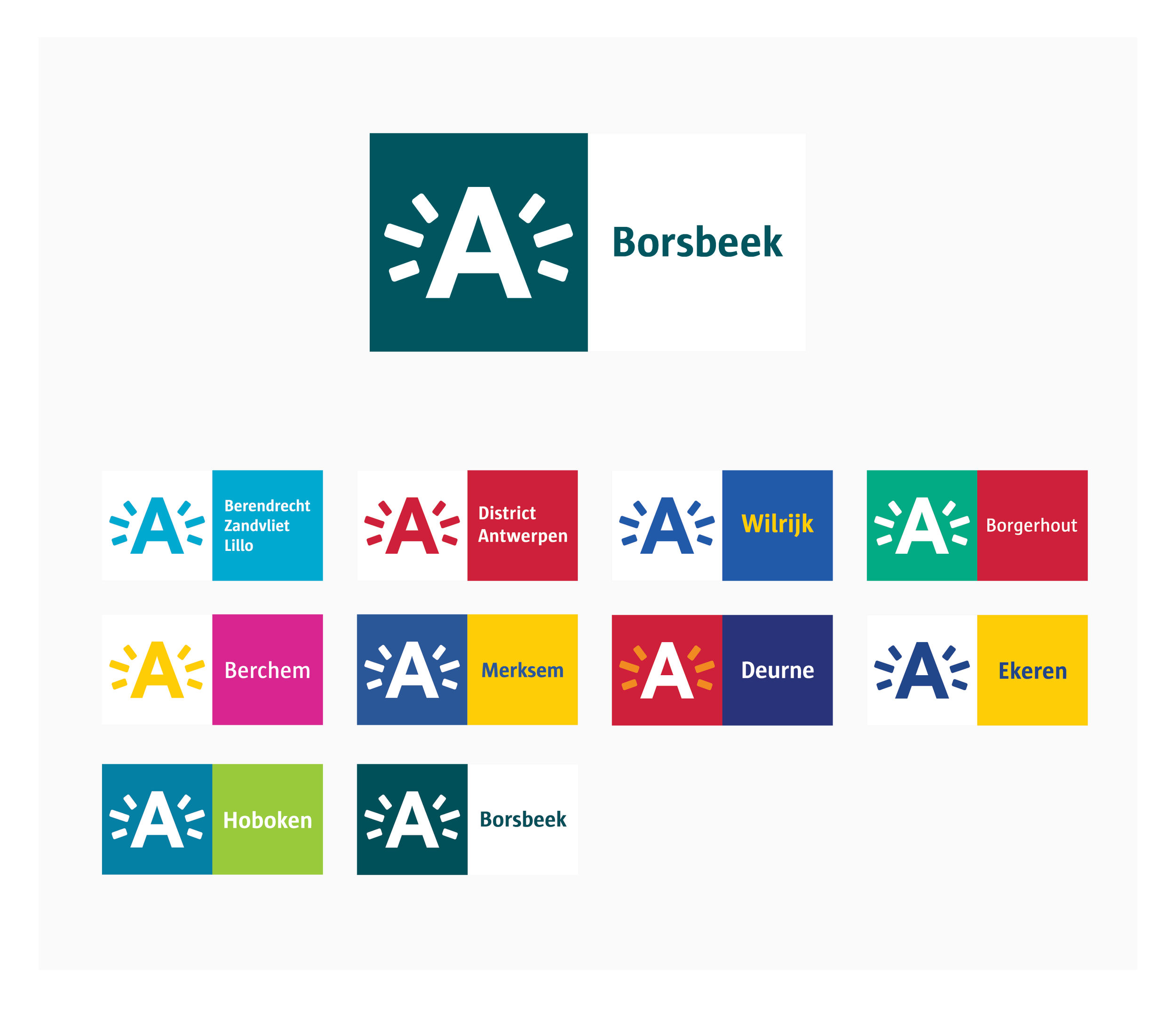
To enhance the green environment of Borsbeek, I have chosen teal, a combination of green and blue, as the main colour for the logo in combination with white. To create a greater differentiation from other districts, I place ‘Borsbeek’ against a white background, allowing the name of the district to stand out in contrast to the vibrant photos and warm colours that will be used in the background.
Logo variations and social media versions
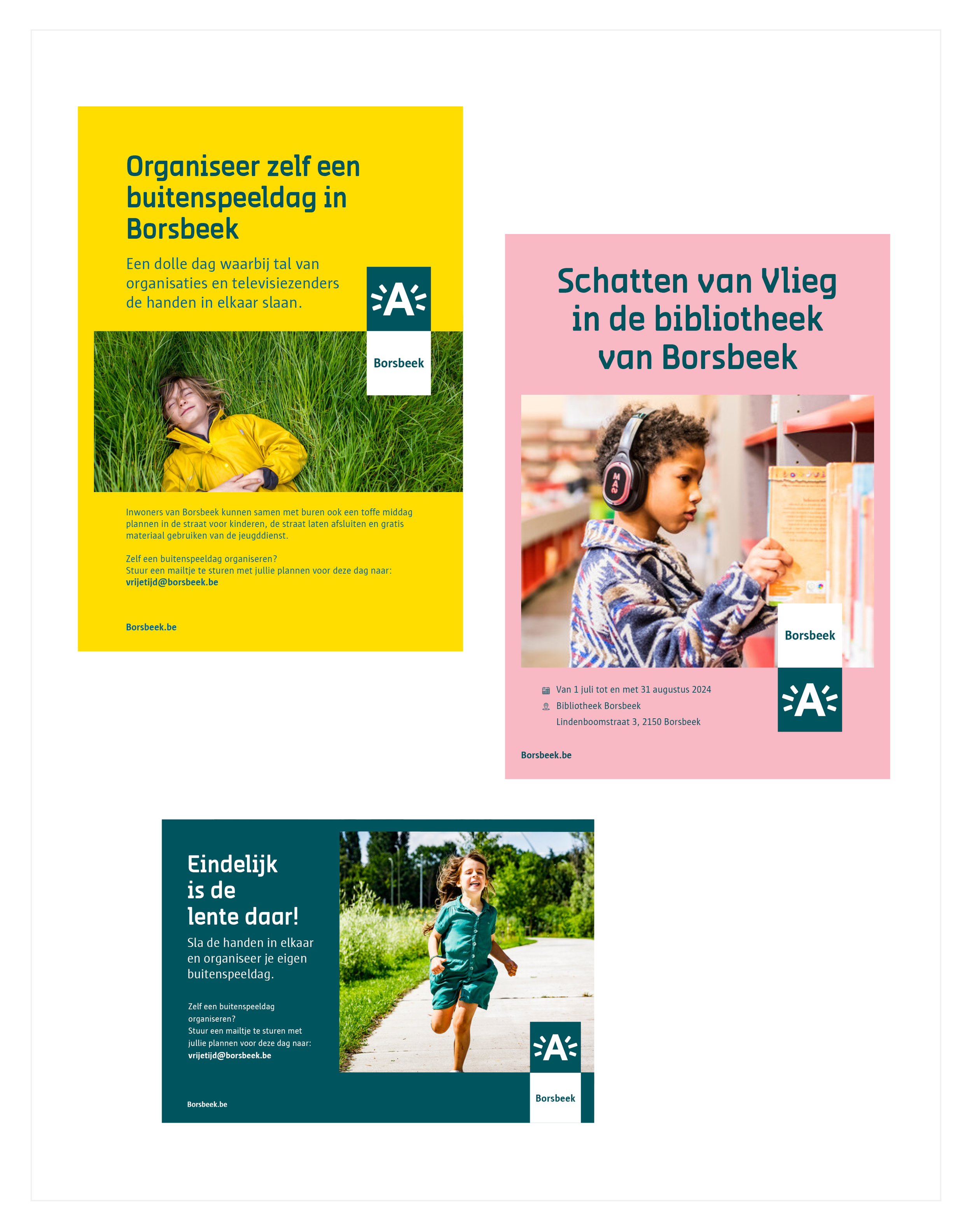
3 Concept for different templates
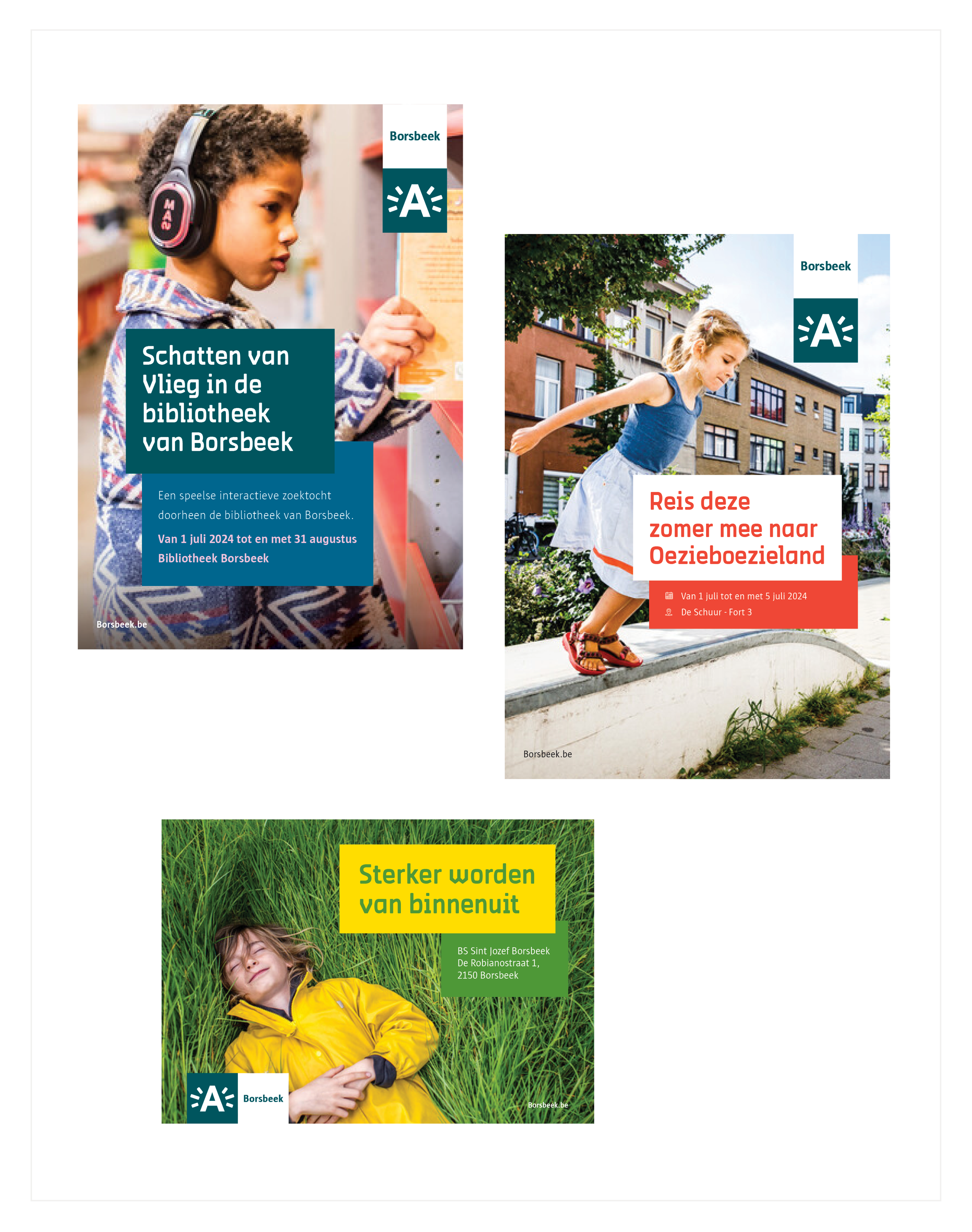
Borsbeek asked me to create three concept templates for various communication purposes. These templates needed to stand out from those of the nine other districts while still fitting within the strict guidelines set by the City of Antwerp.
Concept 1: Dynamic Borsbeek
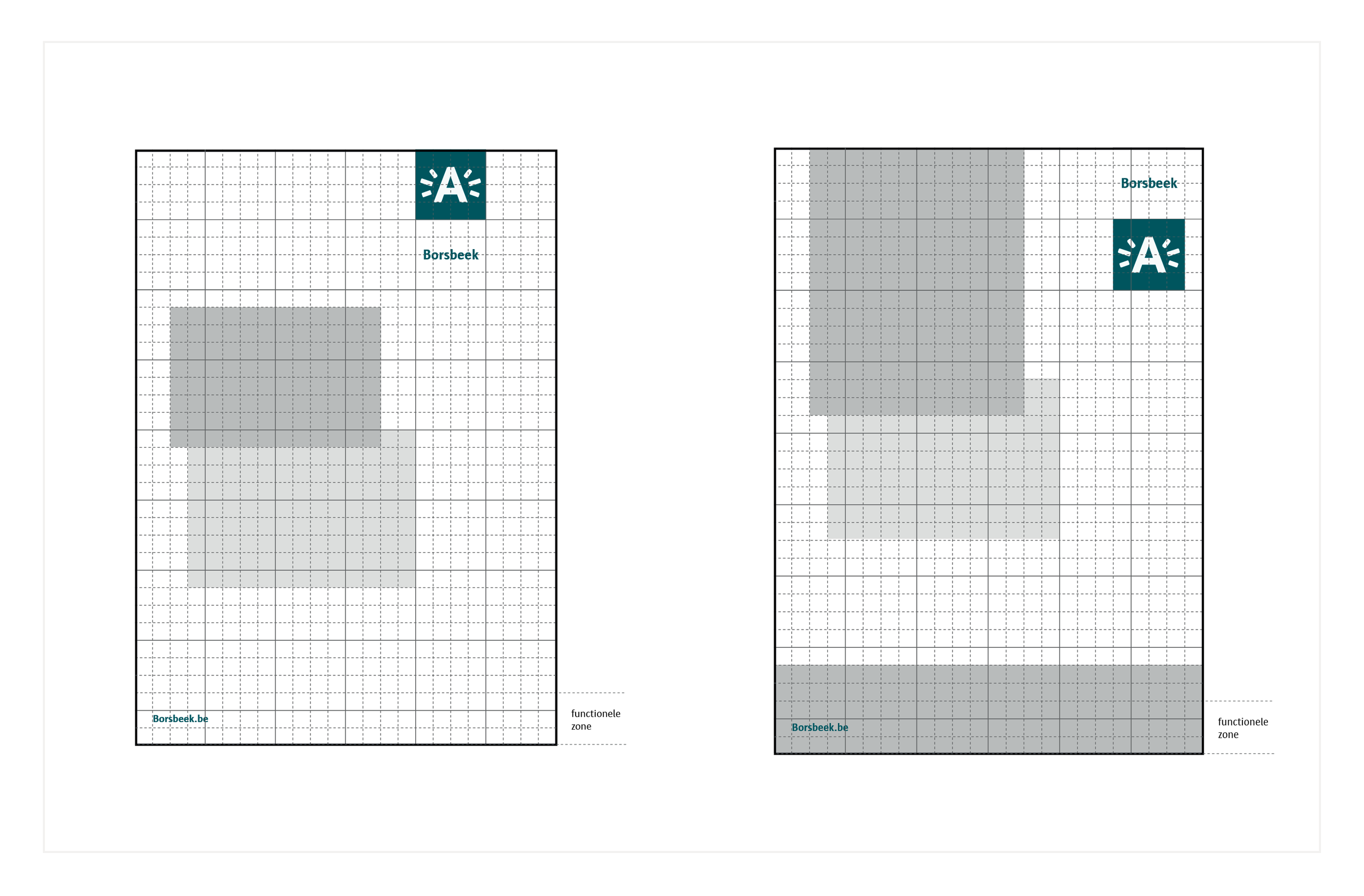
To showcase the diversity of Borsbeek, we use three coloured blocks. This consists of one large block that contains the key content of the message. Additionally, there is a smaller coloured block, complemented by a colourful accent line. The white ‘Borsbeek’-rectangle of the logo always needs to overlap over the biggest colour block, this way we guarantee sufficient contrast, allowing Borsbeek as a district to quite literally stand out in the campaign.
Concept 2: Borsbeek View
This concept literally offers a view of Borsbeek. By framing an image of Borsbeek with a coloured block, we draw attention to the community. It is important that the ‘Borsbeek’-rectangle of the logo always overlaps with the image of Borsbeek.
Concept 3: Borsbeekse Blocks
Here, the content is placed within two coloured blocks that form the letter 'B' of Borsbeek. These blocks are responsive and adjust according to the content of the message. The first block always overlaps the second one.
Disclaimer: It is important to mention that this concept phase is not yet complete, the municipality of Borsbeek still needs to make final decisions regarding colours and templates. These designs are therefore not final and serve purely as concepts for presenting the branding.


