Antwave - branding
In early 2024, I pursued a postgraduate course in branding at the School of Branding, Artevelde Hogeschool. As part of this program, I developed a comprehensive branding project—from strategy to visual identity. We were assigned a client, Antwave, specializes in building advanced e-commerce platforms and offers optional warehousing services as part of the parent company, Kick and Rush, with whom we conducted a workshop to gain insights into their brand. This allowed us to develop a strategy that ultimately led to creating a visual brand identity.
Client: Antwave
Tools: Adobe Illustrator - Figma - Adobe Animate
Credits: School of Branding Antwave team - Antwave
To kick off this journey, we facilitated a workshop aimed at uncovering the core purpose of Antwave. We began with the essential question: "Why are we here?" Establishing a clear "why" simplifies understanding what a brand stands for. The objective was to distill the client’s identity, eliminating jargon, and clarifying the answers to these six fundamental questions:
Why are we here?
What do we do, and how do we do it?
What makes us different?
Who are we here for?
What do we value the most?
What’s our personality?
Kick-off workshop
In addition to the workshop, we conducted extensive research on the competition and the current landscape in which Antwave operates. With insights from both the workshop and the research, we developed a clear positioning statement.
Position statement of Antwave
Playfield of Antwave
Following this, we defined the brand’s tone of voice and personality, culminating in the creation of a final brand story.
At the end of this strategic phase, we created a cheat sheet—an overview of all insights and research. The cheat sheet served as a critical tool for developing design territories (mood boards), laying the groundwork for Antwave’s visual branding.
Next, I developed four visual brand territories (mood boards). These allowed me to refine the brand's visual language before moving to the final design stage.
Concept sketches of the logo
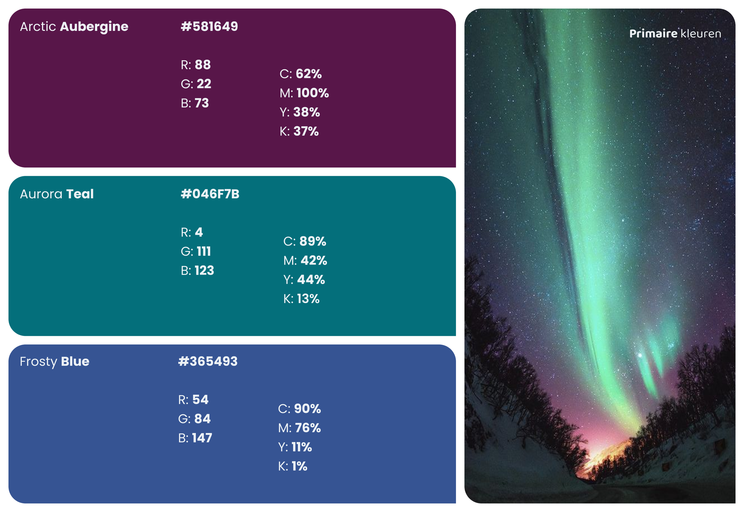
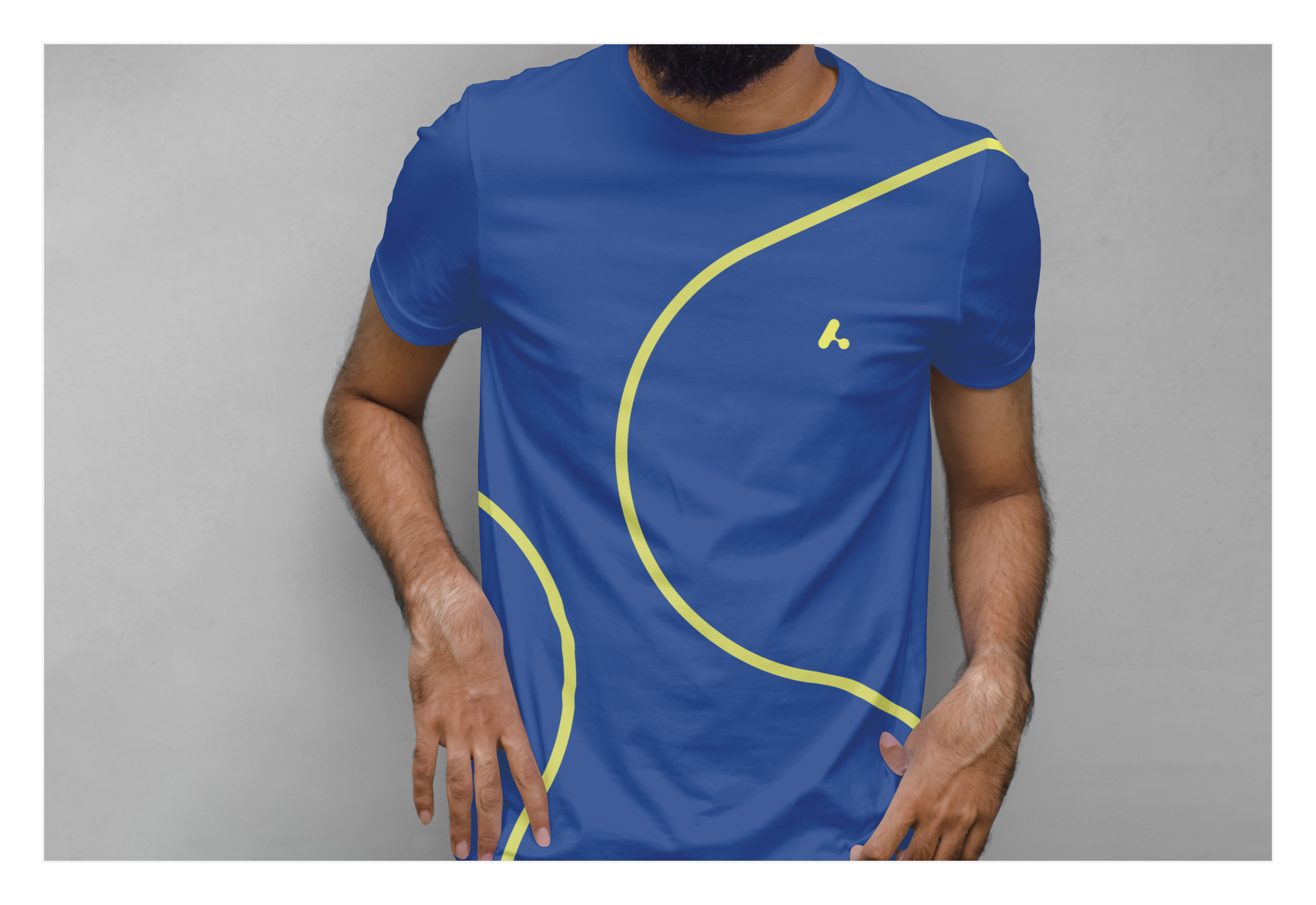
In the concluding phase, I created the design fundamentals, establishing the core visual identity for Antwave. The visual identity was crafted to ensure consistency across all touchpoints—from logo design, to the color palette to typography and imagery.
Different versions of the Antwave logo
PowerPoint Slide deck
Throughout the project, I collaborated closely with the client, as well as my fellow students. The strategy was decided in a small group of 6 students, whereas the visual identity was crafted independently.
A big thanks go to School of Branding, Henk Willems and my fellow students: Jens, Dagmar, Lukas, Lien and Alexander.
To our guest lecturers: Stef Hamerlinck, Tom Andries from Today Agency, the people from Skinn Agency, Thierry Brunfaut from Base Design, the people from KAN Design, Sebastien Greffe from We want more and Jill Mathieu from Goodcopy.


